Rebuilding Newmark's Deal Submission Flow
How I redesigned a dreaded legacy form into a guided, self-checking flow.
TL;DR
- Problem: Newmark's legacy deal submission form was a single dense page modeled on its own database — confusing enough to need a PDF instruction guide, and so unwieldy that senior brokers routinely paid or delegated their way out of filling it in.
- What I designed: A leaner, guided, four-phase replacement inside Workframe — including a new navigation pattern that was later adopted into Workframe's shared design system.
- My role: Sr. Product Designer at Newmark, working on the Workframe platform. I led design end-to-end through build support.
- Outcome: A single dense, database-shaped page became a guided, self-checking flow; Stepper outlived this specific project to become a reusable pattern.
Discovery
Context & constraints
- Every deal a broker closed needed to be submitted through an internal system before commission could be paid.
- Deal Submission needed to move out of that legacy system entirely and into Workframe, the platform brokers already used to track their deals — becoming something brokers could complete themselves. Folding a core, high-frequency workflow into Workframe was also a way to help grow its adoption.
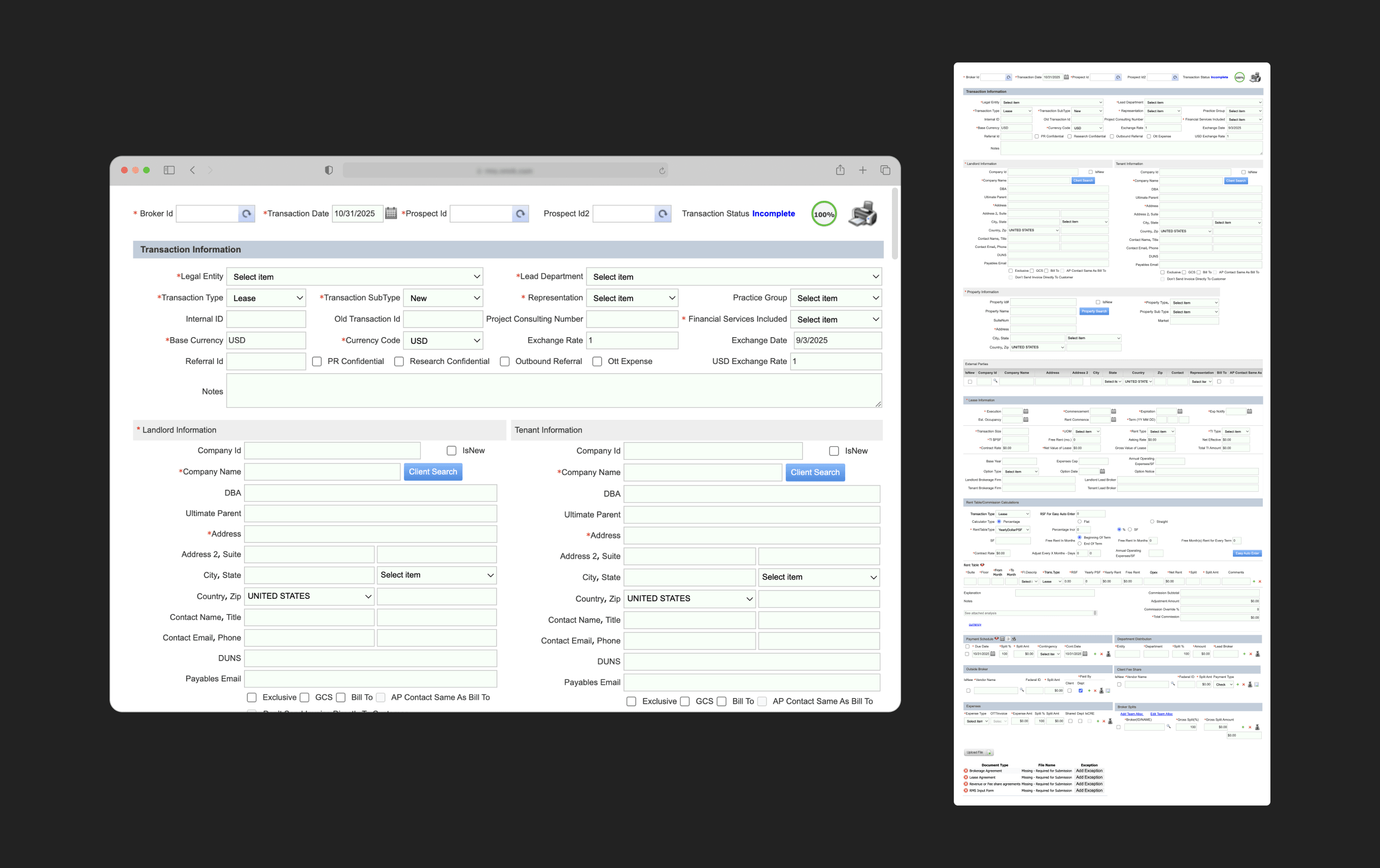
Legacy form
Research
Research was mainly fed by conversations with broker managers, senior brokers, and junior brokers — the people closest to how deals actually got submitted. Here are some of the findings:
- A PDF instruction guide was created internally to walk brokers through the legacy form, which became a stand-in for real usage patterns.
- Although brokers were already uploading a lease agreement, commission agreement, and brokerage agreement, they had to manually type information already presented in those documents.
- Brokers would often delegate the deal submission to junior brokers, or to an external third-party team, because data entry was considered tedious and manual, not worth their time.
I did a deep dive into the legacy form myself, comparing it against the PDF guide and weighing what I'd learned from the interviews, then paired that with Nielsen's 10 usability heuristics to catalog the problems more systematically. A few of the clearest issues:
Everything, exposed at once
The form was entirely on one page, and felt bulky and crammed, with 120 fields across 14 sections. Every field the database could ever need was exposed at once, regardless of relevance or a given lease's specifics, rather than the system adapting to context.
Re-typing what the system already had
Brokers had already uploaded a lease agreement, commission agreement, and brokerage agreement — yet still had to manually type information straight out of those documents, instead of the system recalling data it already had.
Help that lived outside the system
The form's only guidance was a PDF instruction guide, created and sent to brokers by their managers from outside the system, rather than help available in context at the moment it was actually needed.
Problem definition
A process meant to close the deal had quietly become its own added cost — in time, and sometimes money, before commission could even be paid.
How might we design a fast and accurate deal submission flow?The redesign
Working with the product manager, discovery turned into a set of requirements for the new flow: it needed to feel navigable, leaner, dynamic, supportive, and self-checking. After some exploration, I believed a few design decisions would get me there.
1. A guided, phased flow over a single long page
The legacy form didn't have a well-defined hierarchy, so the first thing I did was reorganize the information architecture.
I broke the sections into 4 chunks, making the form more digestible by reducing cognitive load. Then I worked with junior brokers to validate the ordering and make sure it reflected how they actually worked.
While the documents section was last on the legacy form, in the new IA it jumped to the first section, as part of the strategy to extract the data and pre-populate the form early.
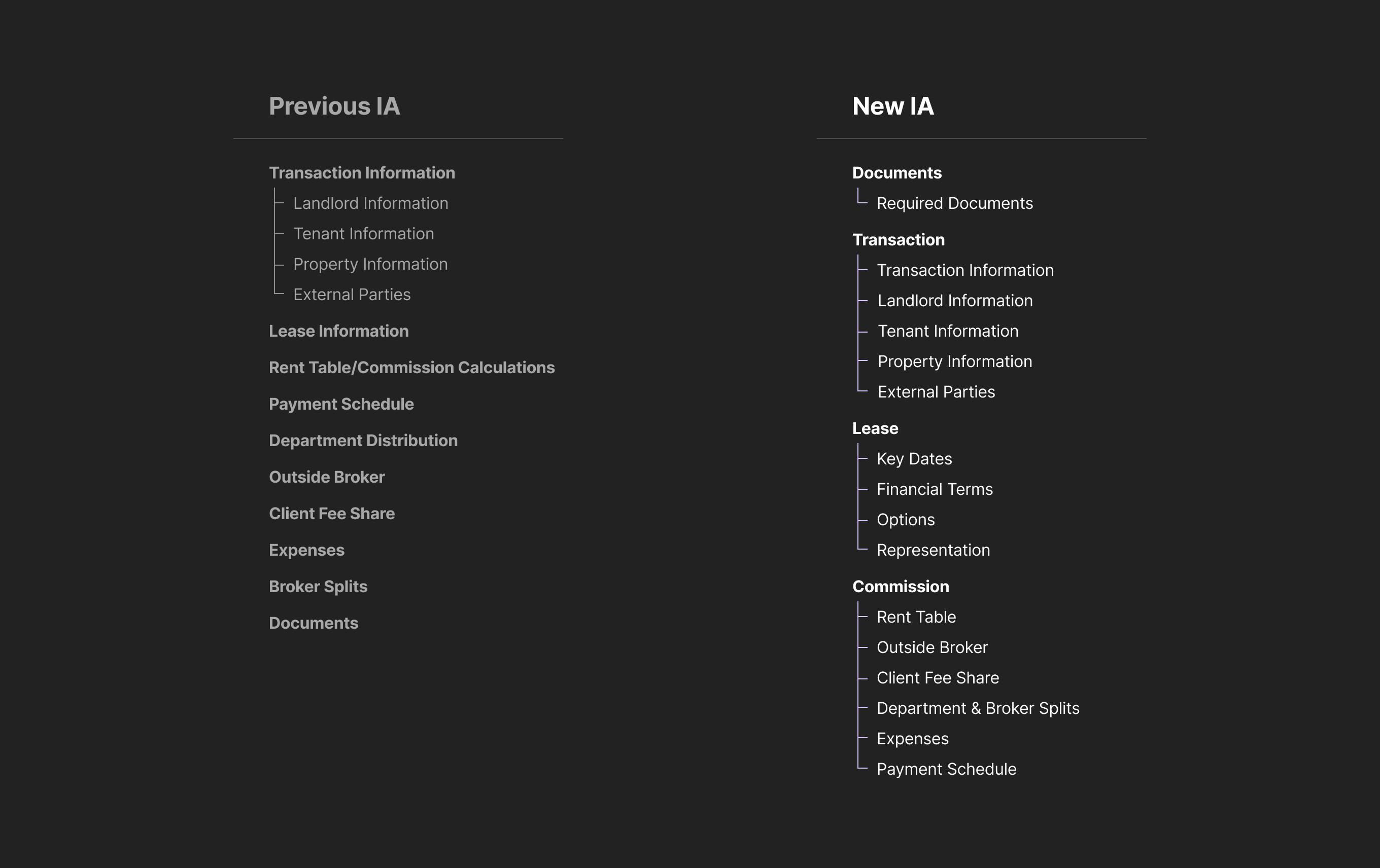
Previous IA and New IA - Chunking the form into 4 phases
The one-page form became a multi-step form with four steps. The final layout featured a vertical Stepper component to track the steps and handle the navigation.
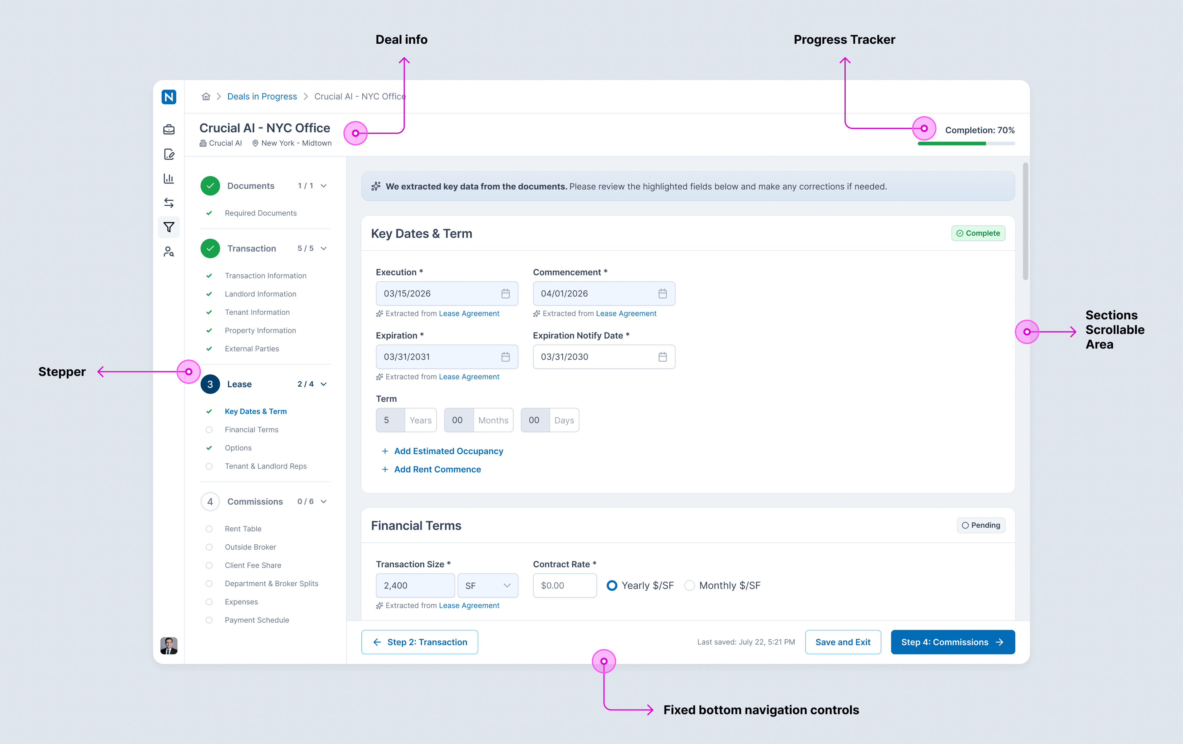
Multi-step form layout
2. Progressive disclosure over a flat form
As mentioned earlier, the legacy form exposed every field the database could ever need, regardless of relevance.
A couple design decisions using progressive disclosure were made to make the form less dense and more contextual to each deal. Progressive disclosure is a design pattern that allows users to reveal more content by clicking or tapping an element.
Moving optional fields behind a simple “Add” action while required fields stay visible by default makes the form feel cleaner, while still allowing brokers to add situational data as needed.
Adding and removing optional fields.
Sometimes required fields would only apply for a specific situation, such as having external brokers involved in the deal.
Conditional questions define the need for additional required fields, which are then added to the form and influence the section completion status.
Conditional question — if Yes, additional required fields are shown. If No, section status is updated to complete.
3. Auto-fill from documents already in hand
Based on an existing Workframe capability, I designed a flow that extracts the uploaded documents and auto-fills the form with data from the lease, commission, and brokerage agreements.
Document upload and extraction.
Extraction isn't guaranteed to be perfect, so I designed a data extraction review flow to show exactly where each auto-filled value came from in the source document. Brokers can trace any field back to the exact spot in the lease, commission, or brokerage agreement it was pulled from, then keep or reject it.
Brokers can review, then keep or reject the auto-fill suggestions from the extracted data.
4. Making the split easier to read
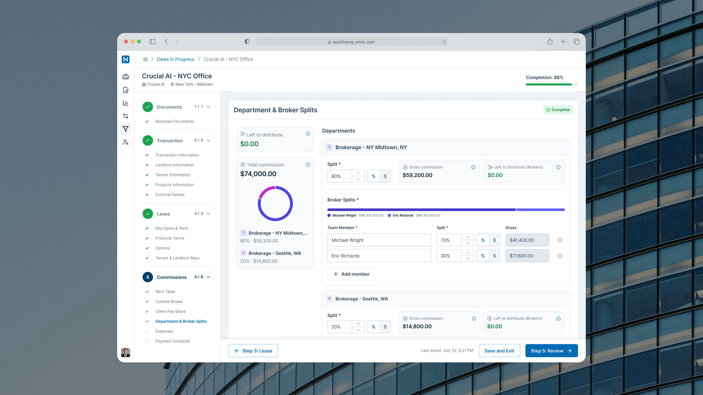
Department & Broker Splits, a crucial section of the form, divides commission across departments and team members — numbers that are hard to reason about as plain text. I paired the raw inputs with visualizations: a donut chart showing the distribution across departments, and a segmented bar showing how a split breaks down among team members, so brokers could see the shape of a split at a glance instead of doing the math themselves.
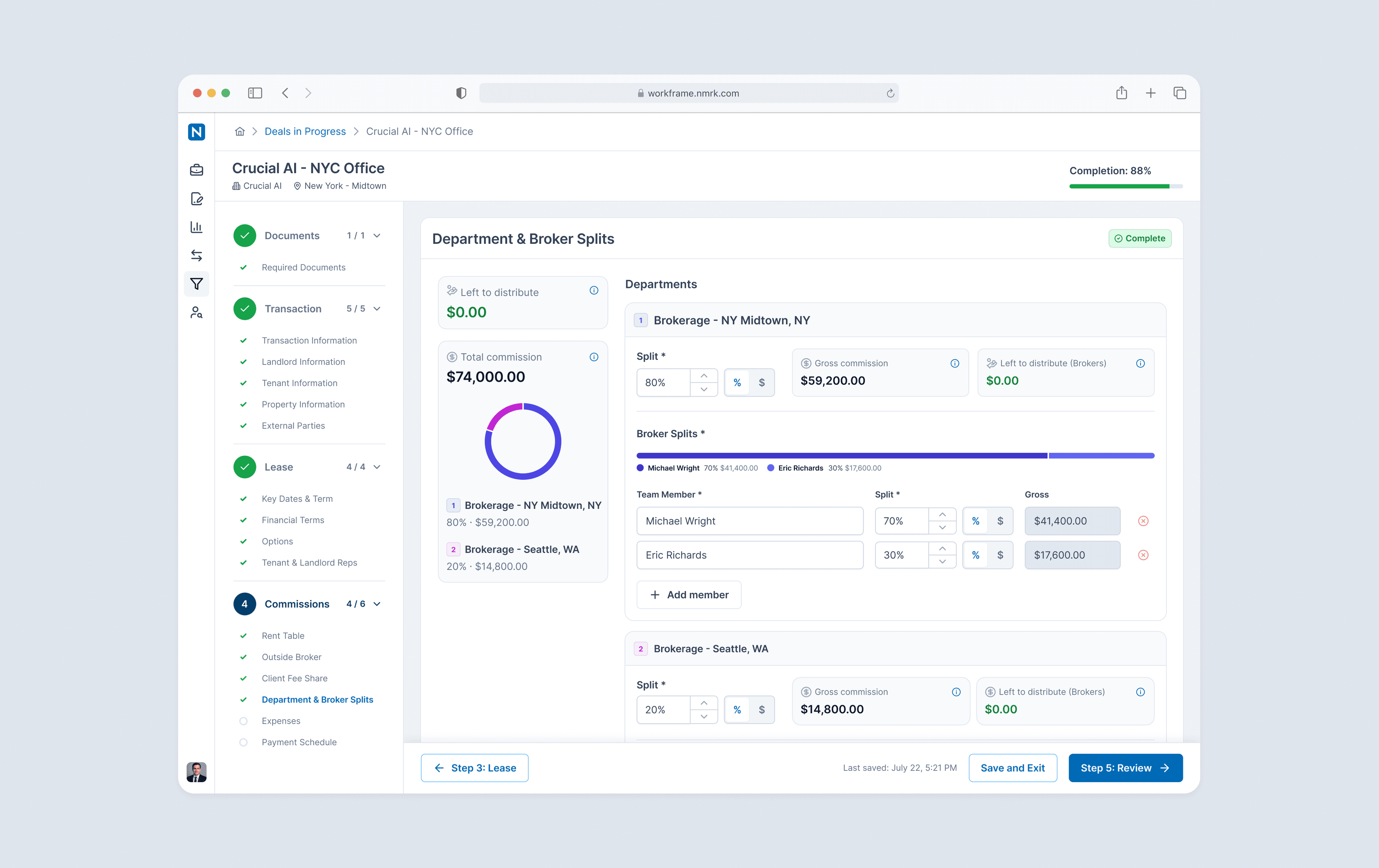
Department & Broker Splits screen, showing the donut chart and segmented bars
I also designed “Left to distribute” states at both the department and broker level, flagging exactly how much commission still needs to be assigned before a split counts as complete.
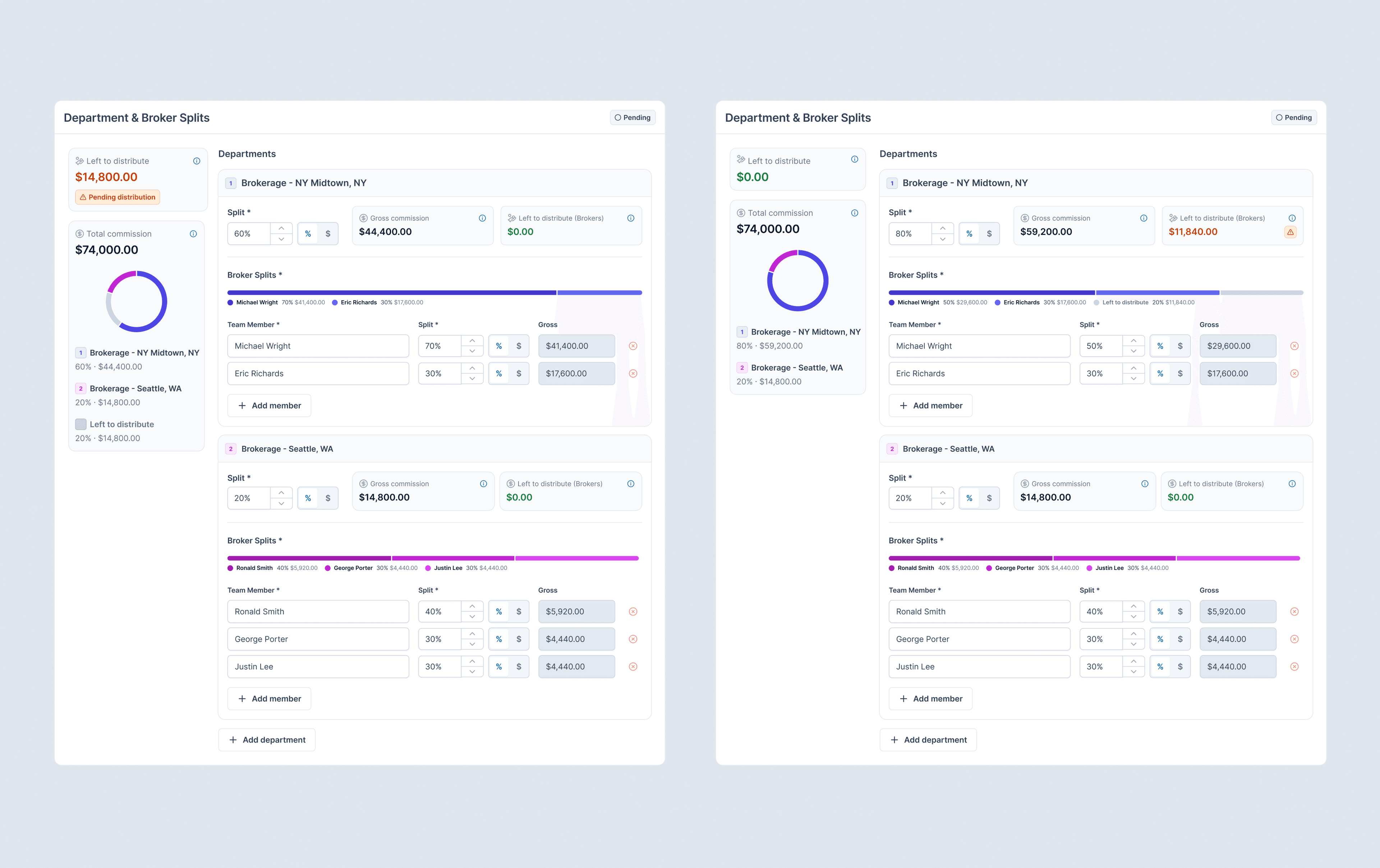
'Left to distribute' flagged at both the department level (left) and the broker level within a department (right)
5. Help, right where it's needed
On the legacy form, the only guidance available was a PDF instruction guide living entirely outside the system. In the new flow, help lives in the form itself: contextual banners sit at the top of sections that need more context, and tooltips surface on hover next to individual fields — guiding brokers in the moment instead of sending them off to a separate document.
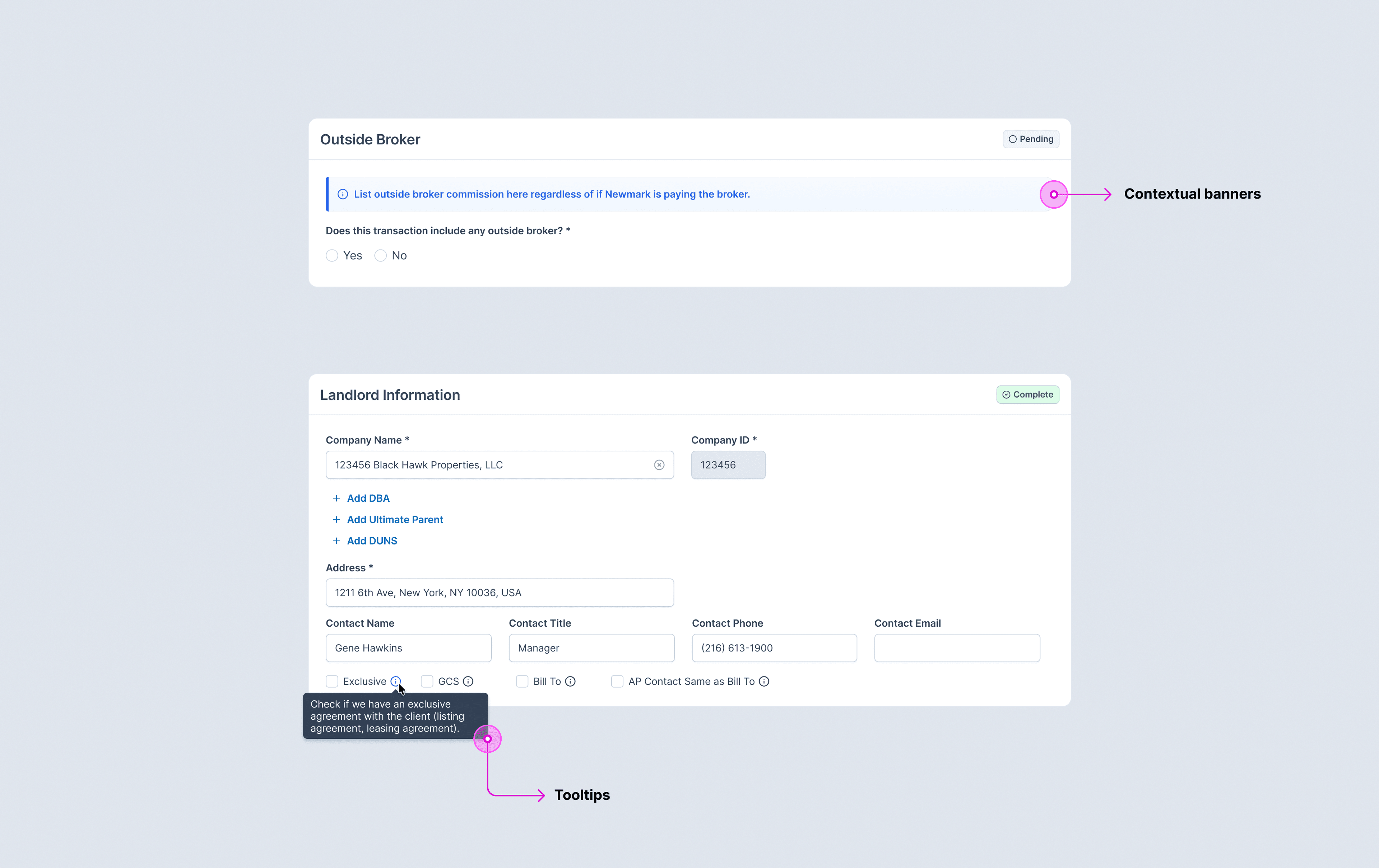
Contextual banner and tooltip example
6. A flow that checks itself
Progress is visible at every level: a completion percentage tracks the whole submission, and each section carries its own Pending/Complete status as a broker works through it.
At review, a broker sees exactly which sections and fields still need attention before they can submit — nothing left to guess at.
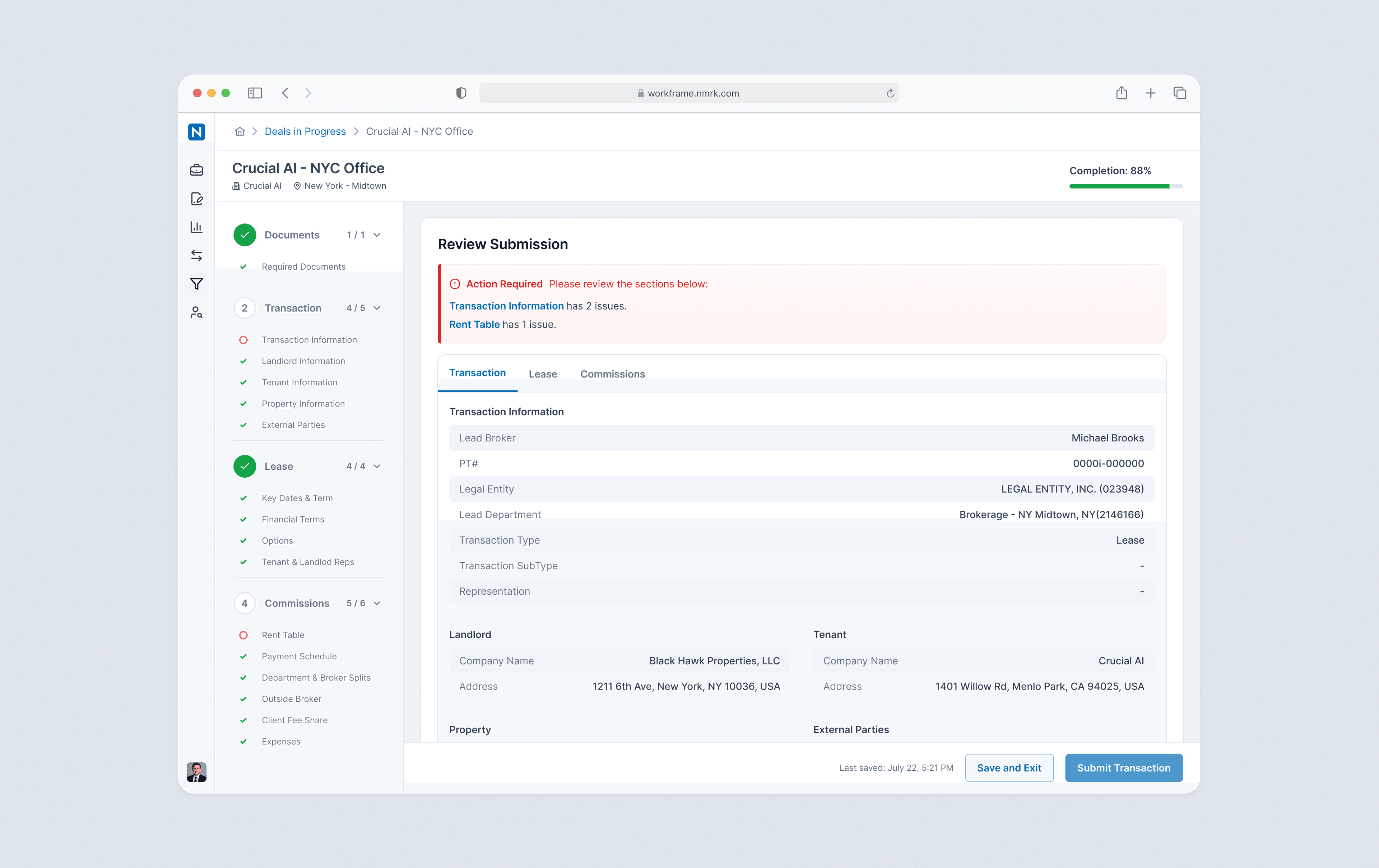
Review screen showing which sections still need attention
Outcomes & impact
My contract with Newmark wrapped during a company restructure before this project launched, so what follows is the outcome I expect, not one I got to measure.
- A single dense, database-shaped page became a guided, self-checking flow.
- One piece of it — Stepper — outlived this specific project to become a pattern the rest of Workframe could reuse.
- Pulling a core, high-frequency workflow like Deal Submission into Workframe was itself a step toward growing platform adoption.
- The metrics I'd have watched: completion time per submission, the rate of submissions bounced back by the revenue team for errors, the share of deals submitted directly by the closing broker rather than delegated, and Workframe adoption/usage among brokers who'd previously only touched the legacy tool.

“Pedro is a standout product designer who brings an exceptional level of rigor and precision to every project. He possesses a rare talent for deconstructing complex, high-friction workflows and transforming them into streamlined, intuitive experiences that prioritize the end-user. His deep commitment to usability, paired with a meticulous eye for detail, ensures that even the most technical challenges are met with elegant, functional solutions. Any team would be fortunate to have his expertise and vision driving their product forward.”
Shawn Martin
Head of UX, Newmark